
Custom schema field types
Apostrophe's schema field types cover many situations, but we might wish to add a new one.
A schema field has two parts: a server-side part and a browser-side part. The server-side part is responsible for sanitizing the input received from the browser, while the browser-side part is responsible for providing the admin UI.
Implementing the server-side part
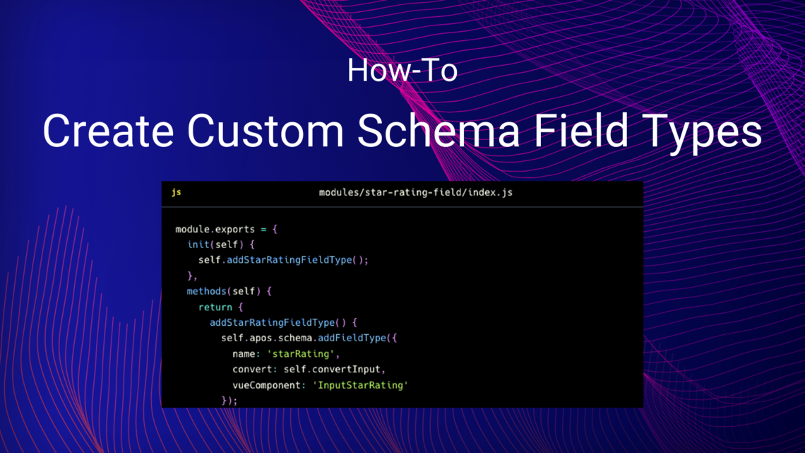
Any module can register a schema field type on the server side, like this one, which allows editors to set a "star rating" of 1 to 5 stars, as is often seen in movie and restaurant reviews.
Note that this code could be in any module. Here we've chosen to create a module just for this new field type, since it might be used in several modules.
module.exports = {
  init(self) {
    self.addStarRatingFieldType();
  },
  methods(self) {
    return {
      addStarRatingFieldType() {
        self.apos.schema.addFieldType({
          name: 'starRating',
          convert: self.convertInput,
          vueComponent: 'InputStarRating'
        });
      },
      async convertInput(req, field, data, object) {
        const input = data[field.name];
        if ((data[field.name] == null) || (data[field.name] === '')) {
          if (field.required) {
            throw self.apos.error('notfound');
          }
        }
        object[field.name] = self.apos.launder.integer(input, field.def, 1, 5);
      }
    }
  }
}
In init, which runs when the module is initialized, we call our addStarRatingFieldType method. init is the right place to invoke code that should run when the Apostrophe process starts up.
In addStarRatingFieldType, we invoke self.apos.schema.addFieldType to add our custom field type on the server side. We provide:
name, which can be used as atypesetting when adding the field to a schema.convert, a function to be used to sanitize the input and copy it to a destination. We pass ourconvertInputmethod for this purpose. Methods of our module are available as properties ofself.component, the name of a Vue.js component to be displayed when editing the field.
In convertInput, we sanitize the input and copy it from data[field.name] to object[field.name]. Since we must not trust the browser, we take care to sanitize it with the launder module, which is always available as apos.launder. But we can validate the input any way we like, as long as we never trust the input.
Implementing the browser-side part
On the browser side, we'll need a custom Vue.js component. Apostrophe provides a Vue.js mixin, AposInputMixin, that does much of the work for us.
<template>
  <AposInputWrapper
    :modifiers="modifiers" :field="field"
    :error="effectiveError" :uid="uid"
    :display-options="displayOptions"
  >
    <template #body>
      <div class="apos-input-wrapper">
        <button v-for="index in 5" :key="index" @click="setValue(index)" class="rating">{{ isActive(index) ? '☆' : '★' }}</button>
        <button class="clear" @click="clear">Clear</button>
      </div>
    </template>
  </AposInputWrapper>
</template>

<script>
import AposInputMixin from 'Modules/@apostrophecms/schema/mixins/AposInputMixin';

export default {
  name: 'InputStarRating',
  mixins: [ AposInputMixin ],
  methods: {
    validate(value) {
      if (this.field.required) {
        if (!value) {
          return 'required';
        }
      }
      return false;
    },
    setValue(index) {
      this.next = index;
    },
    clear() {
      this.next = null;
    },
    isActive(index) {
      return index <= this.next;
    }
  }
};
</script>

<style lang="scss" scoped>
  .rating {
    border: none;
    background-color: inherit;
    color: inherit;
    font-size: inherit;
  }
</style>
In our template element, AposInputWrapper takes care of decorating our field with a label, error messages, etc. All we have to do is pass on some standard props that are provided to us. Beyond that, our responsibility is to display the current value to the user. We also add event handlers to handle user input, as explained below.
In our script element, we have just two jobs: assigning a new value to this.next whenever the value changes, and validating the user's input. The AposInputMixin does the rest of the work for us.
To update this.next, we implement methods that respond to click events, like the setValue and clear methods in this example. To validate the user's input, we implement a validate method, which accepts the current value and checks constraints like the required property of the field. If there is a problem, we return an error code such as required, min or max, otherwise we return false. The field configuration is available to us as this.field.
The style element takes care of CSS for this component. Note that SCSS syntax is available. To avoid conflicts, using the scoped attribute is recommended.
WARNING
If it doesn't seem to work at first, make sure you launched npm run dev with the APOS_DEV=1 environment variable setting as explained earlier. This ensures the Apostrophe admin UI is rebuilt on each code change. You can stop using it when you are finished changing admin UI code.
Putting the new schema field type to work
Now we can use the new schema field type in any piece or widget much as we would use an integer field:
fields: {
  add: {
    rating: {
      type: 'starRating',
      label: 'Star Rating',
      required: true
    }
  }
}
The resulting value is then available as the stars property of the piece or widget, with an integer value between 1 and 5.