Extensions & Integrations
Styles Editor


Apostrophe Palette


Empower content creators to customize design instantly with visual CSS editing directly in the ApostropheCMS interface. No code required—just point, click, and watch your site transform in real-time.
Why Apostrophe Palette?
- 🎨 Visual Design Control: Content creators can adjust colors, spacing, and styling without touching code
- ⚡ Real-Time Preview: See changes instantly as you edit—no page refreshes needed
- 🛠️ Developer-Friendly: Define exactly which properties can be modified and set safe boundaries
- 🎯 Brand Consistency: Maintain design system integrity while enabling customization flexibility
- 👥 Team Collaboration: Bridge the gap between designers, developers, and content creators
- 🚀 Zero Technical Barriers: Marketing teams can fine-tune campaigns without developer intervention
Usage
The Palette module transforms how your team handles website design changes. Instead of requiring developers for every visual adjustment, content creators and marketers can modify colors, spacing, typography, and other design elements directly through the ApostropheCMS interface.
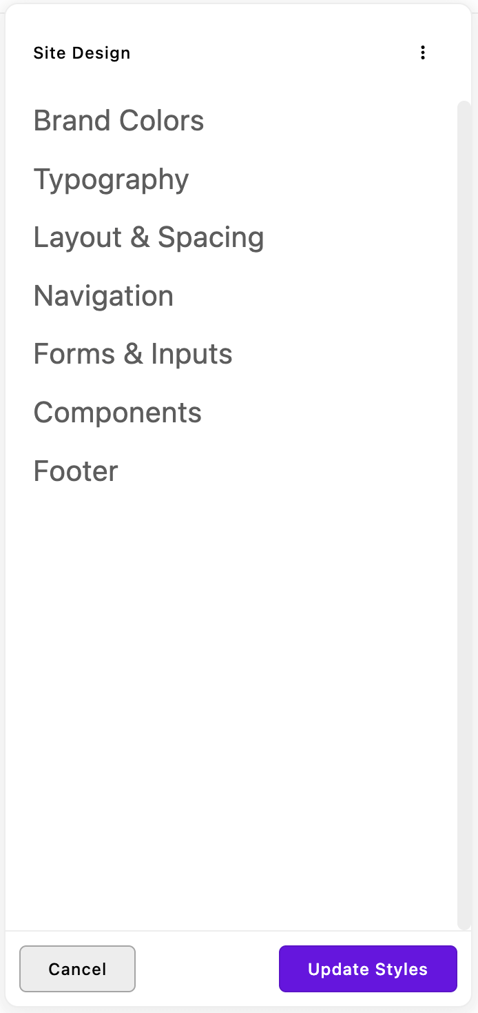
How It Works for Content Creators
- Access the Palette: Look for the paint palette icon in your ApostropheCMS admin interface
- Choose Your Design Element: Select from organized tabs like "Colors," "Typography," or "Spacing"
- Make Changes Visually: Use color pickers, sliders, and dropdowns to adjust your site's appearance
- See Results Instantly: Watch your changes appear in real-time without page refreshes
- Publish When Ready: Save your changes to make them live across your entire site
What Developers Control
Developers maintain full control by defining style controls through familiar schema fields—just like creating any other ApostropheCMS content type. You specify:
- Which elements can be modified (buttons, headers, backgrounds, etc.)
- What properties are adjustable (color, size, spacing, etc.)
- Safe ranges and limits (minimum/maximum values, approved color palettes)
- Organized interface (grouping related controls into logical sections)
This creates a perfect balance: content creators get design freedom within boundaries that maintain your site's integrity and performance.
Compatibility
This version requires the latest ApostropheCMS. When adding this module to an existing project, run npm update to ensure all ApostropheCMS modules are up-to-date.
Installation
Note: This module requires an ApostropheCMS Pro license. Don't have Pro yet? Create an account on Apostrophe Workspaces or contact us and get started with ApostropheCMS Pro to access this and other Pro extensions.
Install the Pro module in your ApostropheCMS project:
npm install @apostrophecms-pro/palette
Quick Start
Configure the module in your app.js file:
import apostrophe from "apostrophe";

apostrophe({
  root: import.meta,
  shortName: "my-project",
  modules: {
    "@apostrophecms-pro/palette": {
      fields: {
        add: {
          backgroundColor: {
            type: "color",
            label: "Page Background",
            selector: "body",
            property: "background-color",
          },
          accentColor: {
            type: "color",
            label: "Brand Accent Color",
            selector: ":root",
            property: "--accent-color",
          },
        },
        group: {
          colors: {
            label: "Colors",
            fields: ["backgroundColor", "accentColor"],
          },
        },
      },
    },
  },
});
That's it! The Palette interface will automatically appear in your Admin UI, and stylesheets will be injected into your pages.
Core Features
Visual CSS Editor
The Palette module creates an intuitive interface where content creators can modify CSS properties in real-time. Developers define which properties can be changed, and content creators use simple controls to adjust colors, spacing, typography, and more.
Organized Field Groups
Organize your design controls into logical groups and tabs for easy navigation. For more complex organization, nested grouping is also available in the advanced configuration section.
fields: {
  add: {
    primaryColor: {
      type: 'color',
      label: 'Primary Color',
      selector: ':root',
      property: '--primary-color'
    },
    buttonSpacing: {
      type: 'range',
      label: 'Button Spacing',
      selector: '.btn',
      property: 'margin',
      min: 0,
      max: 2,
      step: 0.25,
      unit: 'rem'
    }
  },
  group: {
    branding: {
      label: 'Brand Colors',
      fields: ['primaryColor']
    },
    layout: {
      label: 'Layout & Spacing',
      fields: ['buttonSpacing']
    }
  }
}
CSS Custom Properties Integration
Work seamlessly with modern CSS custom properties (variables) for maximum flexibility:
accentColor: {
  type: 'color',
  label: 'Site Accent Color',
  selector: ':root',
  property: '--accent-color'
}
Then use the variable throughout your CSS:
.button {
  background-color: var(--accent-color);
}

.highlight {
  border-left: 3px solid var(--accent-color);
}
Field Types & Configuration
Supported Field Types
The Palette module supports a focused set of field types optimized for visual design controls. While other ApostropheCMS field types may work, only these are officially supported and guaranteed to function properly:
color: Color picker for background colors, text colors, and bordersrange: Slider controls for spacing, sizes, and numeric valuesstring: Text input for font names, custom values, and CSS stringsselect: Dropdown menus for predefined options like font weights or display modes
Note: Using other field types is not recommended and may result in unexpected behavior.
Essential Field Properties
selector
Define which elements to target (string or array). Supports any valid CSS selector:
selector: ".header"; // Class selector
selector: "#main-content"; // ID selector
selector: "body"; // Element selector
selector: ":root"; // Pseudo-class (for CSS custom properties)
selector: '[data-theme="dark"]'; // Attribute selector
selector: ".btn:hover"; // Pseudo-class with element
selector: ".container > .row"; // Child combinator
selector: [".btn", ".button", 'input[type="submit"]']; // Multiple selectors
property
Specify which CSS properties to modify (string or array):
property: "color"; // Single property
property: ["margin-top", "margin-bottom"]; // Multiple properties
property: "--primary-color"; // Custom properties
unit (optional)
Append units to numeric values:
unit: "px"; // Results in "10px"
unit: "rem"; // Results in "1.5rem"
unit: "%"; // Results in "75%"
valueTemplate (optional)
Create complex CSS values with templates:
valueTemplate: "0 0 10px %VALUE%"; // Results in "0 0 10px rgba(0,0,0,0.5)"
valueTemplate: "url(%VALUE%)"; // Results in "url(image.jpg)"
mediaQuery (optional)
Apply changes only within specific media queries:
mediaQuery: "(max-width: 768px)"; // Mobile-only changes
mediaQuery: "(min-width: 1200px)"; // Desktop-only changes
important (optional)
When set to true the rule is appended with !important.
important: true
Advanced Configuration
Nested Field Groups
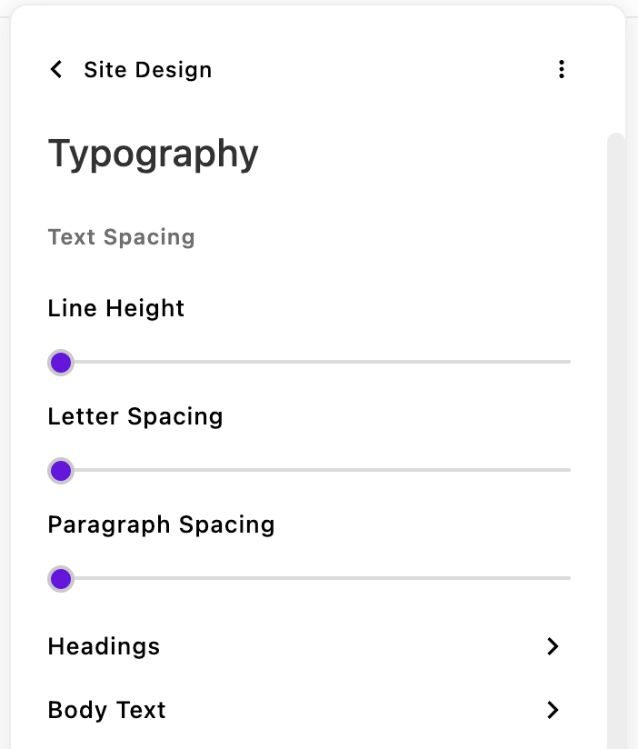
The Palette module offers a unique grouping system that differs from standard ApostropheCMS field configuration. Unlike normal Apostrophe schemas, Palette supports a second level of field grouping to create organized, multi-level interfaces with tabs and sections:
fields: {
  add: {
    // Your field definitions
  },
  group: {
    typography: {
      label: 'Typography',
      group: {
        spacing: {
          label: 'Text Spacing',
          inline: true,
          fields: ['lineHeight', 'letterSpacing', 'paragraphSpacing']
        },
        headings: {
          label: 'Headings',
          fields: ['headingFont', 'headingWeight']
        },
        bodyText: {
          label: 'Body Text',
          fields: ['bodyFont', 'bodySize']
        }
      }
    }
  }
}
How it works:
- Top-level groups appear as tabs in the interface
- Second-level groups create navigable sections within tabs
- Inline groups (
inline: true) render within the current section under a title - Mixed grouping allows both grouped and ungrouped fields within the same tab
This nested structure is specific to the Palette module and provides more organizational flexibility than standard ApostropheCMS field grouping.
Complex Styling Example
Handle sophisticated design controls with multiple selectors and properties:
imageWidgetSpacing: {
  label: 'Image Widget Vertical Spacing',
  type: 'range',
  selector: ['.image-widget', '.gallery-widget'],
  property: ['margin-top', 'margin-bottom'],
  min: 0,
  max: 4,
  step: 0.5,
  unit: 'rem',
  mediaQuery: '(min-width: 768px)'
},
buttonShadow: {
  label: 'Button Drop Shadow',
  type: 'color',
  selector: '.btn-primary',
  property: 'box-shadow',
  valueTemplate: '0 4px 8px %VALUE%'
}
Internationalization
Localize field labels for global teams:
// modules/@apostrophecms-pro/palette/index.js
export default {
  i18n: {
    paletteStrings: {
      browser: true,
    },
  },
  fields: {
    add: {
      primaryColor: {
        type: "color",
        label: "paletteStrings:primaryColor",
        selector: ":root",
        property: "--primary-color",
      },
    },
    group: {
      colors: {
        label: "paletteStrings:colorGroup",
        fields: ["primaryColor"],
      },
    },
  },
};
Create translation files in modules/@apostrophecms-pro/palette/i18n/paletteStrings/:
// en.json
{
  "primaryColor": "Primary Brand Color",
  "colorGroup": "Brand Colors"
}

// fr.json
{
  "primaryColor": "Couleur Principale de Marque",
  "colorGroup": "Couleurs de Marque"
}

// de.json
{
  "primaryColor": "Primäre Markenfarbe",
  "colorGroup": "Markenfarben"
}
How It Works
The Palette module generates CSS dynamically and injects it into your pages. Values are stored as fields in the @apostrophecms/global document (paletteStylesheet and paletteStylesheetVersion) and applied site-wide whenever the stylesheet is included in a template.
When editors make changes:
- Real-time preview: Changes appear instantly without page refresh
- Efficient storage: Values are stored in the global document for site-wide access
- Smart caching: Generated stylesheets are cached with version identifiers
- No performance impact: CSS generation only occurs when settings change
The interface and stylesheets are automatically injected—no template modifications required.
Custom Rendering
For advanced use cases, override the default CSS generation with your own custom logic. This is useful when you need complex CSS transformations or want to integrate with external styling systems.
// modules/@apostrophecms-pro/palette/index.js
export default {
  options: {
    serverRendered: true,
  },
  methods(self) {
    return {
      async getStylesheet(doc) {
        // Access the palette field schema
        const schema = self.schema;

        // The doc parameter contains the global document with palette field values
        // Custom CSS generation logic here
        let css = "";

        // Example: iterate through schema fields to build CSS
        for (const field of schema) {
          if (doc[field.name] && field.selector && field.property) {
            css += `${field.selector} { ${field.property}: ${doc[field.name]}${
              field.unit || ""
            }; }\n`;
          }
        }

        return css;
      },
    };
  },
};
Key points for custom rendering:
serverRendered: truemust be enabled to ensure all rendering requests flow to your custom method, even from the UI during editingself.schemaprovides access to the palette field configuration (selectors, properties, units, etc.)docparameter contains the global document with the actual field values entered by users- Async support - your
getStylesheetmethod can be async whenserverRendered: true - Automatic debouncing - the function is called only when settings change and invocations are debounced to prevent excessive CPU use during editing
- Performance - custom rendering only occurs when palette values change, not on every page request
This approach gives you complete control over CSS generation while maintaining the real-time editing experience.
🏢 Managing Multiple Sites with Distinctive Branding?
Running multiple websites that need unique visual identities while sharing core functionality? The Palette module is perfect for multisite scenarios with ApostropheCMS Assembly:
✨ Palette + Assembly Benefits
- 🎨 Per-Site Branding - Each site gets its own color schemes, typography, and visual styling through Palette
- ⚡ Shared Foundation - Common functionality and base themes across your site network
- 🛠️ Centralized Management - Deploy updates to core features while preserving each site's unique appearance
- 👥 Brand Autonomy - Individual site managers can customize their brand within defined parameters
- 🚀 Consistent Experience - Same powerful editing interface across all sites in your network
- 📊 Unified Control - Manage design boundaries and approved styling options from a central location
Perfect for: Franchises with local branding, agencies managing client sites, organizations with regional offices, or any network of related but distinct brands.
How It Works Together
Assembly provides the multisite infrastructure and deployment management, while Palette ensures each site can maintain its unique visual identity. Site managers get the design freedom they need without compromising your technical architecture or operational efficiency.
Learn more about Assembly multisite hosting or contact our team to discuss how Palette and Assembly can streamline your multisite strategy.
Made with ❤️ by the ApostropheCMS team. Found this useful? Give us a star on GitHub! ⭐