Extensions & Integrations
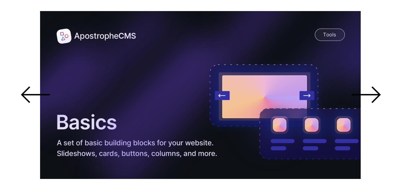
Basics
Basics

The Basics module contains a collection of six widgets designed to enhance your development experience with ApostropheCMS. This package includes hero, card, slideshow, column, button, and footer widgets to streamline the development process and serve as educational tools. Alongside these widgets, the repository contains several configuration files that are used within the widgets, but that can be extended and used project-wide.
Module Structure
/modules: Apostrophe widget modules./lib: Internal configuration helpers/views: Views to be extended by modules or your project
Initializing the bundle and adding widgets
@apostrophecms-pro/basics contains several bundled modules you can opt into.
In app.js
require('apostrophe')({
  shortName: 'my-project',
  // This registers the bundle of modules with your project
  bundles: [ '@apostrophecms-pro/basics' ],
  modules: {
    // required for bundled modules or extending views
    '@apostrophecms-pro/basics': {},
    // optional widgets
    '@apostrophecms-pro/basics-slideshow-widget': {},
    '@apostrophecms-pro/basics-column-widget': {},
    '@apostrophecms-pro/basics-button-widget': {},
    '@apostrophecms-pro/basics-card-widget': {},
    '@apostrophecms-pro/basics-hero-widget': {},
    '@apostrophecms-pro/basics-footer-widget': {},
    ...
  }
}
Available configurations
The @apostrophecms-pro/basics module provides configurations you can tap into for further customization. These are available via the server-side apos object and, in some cases, directly importable.
The configurations are available as:
- Widgets leveraged by
@apostrophecms-pro/basics- Use
require('@apostrophecms-pro/basics/lib/widgets')anywhere you wish in your project and you'll get the same set of widgets that column widget areas get. Or, pass your own object as thewidgetsoption to@apostrophecms-pro/basicsand also use that object elsewhere in your project.
- Use
- Navigation schema
const { navigation } = require('@apostrophecms-pro/basics/lib/navigation');apos.basics.options.navigation
- Link (and button)
const { link } = require('@apostrophecms-pro/basics/lib/link');apos.basics.options.link
- Rich Text
const richText = require('@apostrophecms-pro/basics/lib/rich-text');apos.basics.options.richText
Adding custom navigation
This module comes with a configuration for making a custom or mixed navigation. This allows for linking to internal pages as well as external websites and pages, and for aligning the navigation links relative to a site logo that links to the home page.
Here is an example of the code generated by the navigation with three links and the logo positioned on the left side.
<nav class="navigation">
  <a href="/"><img src="/uploads/attachments/logo.one-third.png"></a>
  <div class="navigation__links">
    <a class="link navigation__link" href="https://www.example.com/about">About</a>
    <a class="link navigation__link" href="/basics">Basics</a>
    <a class="link navigation__link" href="/uploads/attachments/test.csv">Pricing</a>
  </div>
</nav>
This HTML does not come with any CSS styling, so you will need to write your own. For styling purposes, the rendered navigation has outer nav tags with a class of navigation. The links are within a div with a class of navigation__links, and each individual link gets classes of link and navigation__link, no matter the type.
The configuration option for logo position changes markup order. As shown, if the user selects to position the logo to the left, the logo image is added to the markup before the links div. To position to the right, it is placed after the links div. For centered positioning, half of the links are added into the markup before the logo and half after, with both sets wrapped in a div with a navigation__links class.
Here is an example showing how to add the navigation fields to the global settings of a site:
const navigation = require('@apostrophecms-pro/basics/lib/navigation');
module.exports = {
  fields: {
    add: {
      ...navigation,
      // other global fields
    },
    group: {
      navigation: {
        label: 'Navigation',
        fields: [ 'navLogo', 'navLogoAlignment', 'navLinks' ]
      }
    }
  }
};
This will place the navigation schema fields onto a tab named "Navigation".
In /views/layout.html or another appropriate template:
{% import "@apostrophecms-pro/basics:navigation/navigation.html" as navigation %}
{% block beforeMain %}
  <header>
    {{ navigation.render(data.global) }}
  </header>
  <!-- other markup -->
{% endblock %}
Note that you might need to use {{ super() }} in your template if you already have content in the beforeMain block added by another template. You can read more in our documentation
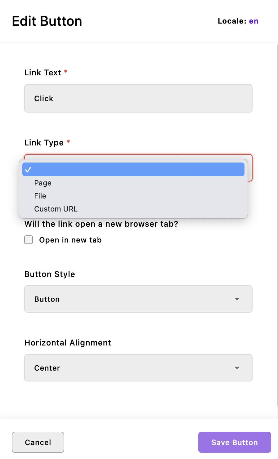
The basics-button-widget
 This widget creates an unstyled div wrapping an
 a link tag. It has three options for alignment: 'left', 'center' and 'right'. These alignments are appended to the button-widget__ class name added to the outer div, along with the button-widget class and any class names added to the className configuration property of the area where the widget is added or at project-level. The link has a class of either inline__link or button__link added, depending on what is selected within the widget schema.
The basics-card-widget
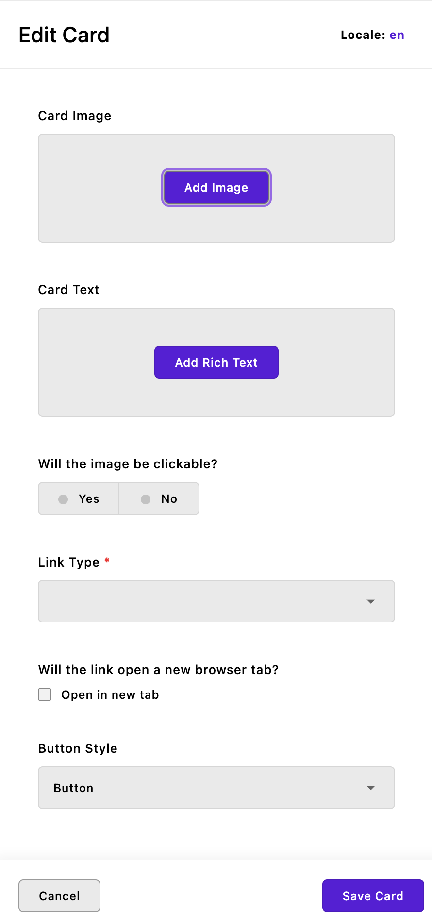 This widget allows you to add an unstyled card with an image, some rich text, and a button. Optionally, the image can also be wrapped in a hyperlink tag.
For styling, the entire card is wrapped in a div with a class name of card-widget and any additional class names that are added to the className configuration of the widget. The image and optional link are wrapped in an outer div with a class of card-widget__img-wrapper. The image itself gets a class name of card-widget__image, while the text for the card is wrapped in a div with a class name of card-widget__text. Finally, if a button is added, it is added to the page as an a tag with either the inline__link or button__link class added. The link is wrapped in a div with the class card-widget__link. Note that if the card image is clickable, the card will not also display a button.
The basics-column-widget
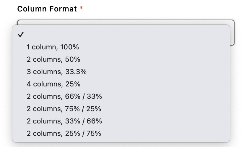 Unlike the other widgets, this widget does have minimal CSS grid styling applied to create the column layouts. Each individual column consists of a div with a class name of
 column-widget__column. Each column will have a single area with all of the widgets, except the basics-footer, from this repo, plus the rich-text, image, video, and html core widgets.
The columns are wrapped in an outer div with class names that depend on the desired layout and alignment of the column contents. No matter the options selected, this div has a class of column-widget and any class names added through the area configuration. The column-widget--align- class name will be appended with the selected content alignment, either top, middle, or bottom. The column-widget-- class name will be appended with a modifier that is specific for the layout and used for targeting with CSS grid to create the selected number of columns of the correct size. This div additionally receives inline styling to set the desired background color.
The basics-footer-widget
This widget is primarily to demonstrate how to extend another custom project module, rather than a core @apostrophe module. It extends the basics-column-widget and has most of the same options and output. However, the content areas for each column are limited. In the options object of the index.js file of the widget, it has a widgets property that passes only the basics-button and @apostrophecms/image widgets. This replaces the more extensive list of widgets that the column widget would normally add to each area. You can accomplish this same replacement of the default widgets by adding a widgets property to the options of the @apostrophecms-pro/basics module at the project level.
The basics-hero-widget
 This widget has some inline styling to allow for the construction of a hero section with a background that can be a solid color, static image with positioning, or a video. This background has an optional overlay with selectable transparency to allow for the text and button of the hero to be more prominent.
The entire widget is wrapped in a section element with a class of hero-widget. Widget styling rules added through the associated stylesheet all use a single class, so they have low specificity and can easily be overruled by adding the section class as a parent selector. You also have the option to add a custom className within the widget configuration. The overlay has a class of hero-widget__screen that you can use, for example, to change it to a different color. The video section similarly has a class of hero-widget__video.
The central content area of this widget can take the core rich-text and image widgets, as well as the basics-button widget. Once again, the button widget needs additional CSS for overall styling and positioning. The content area is wrapped in a div with two classes - hero-widget__content and a dynamic class hero-widget__content--alignment- that is appended with the selection from the widget alignment field.
The basics-slideshow-widget
 This widget can take multiple images with captions and display them a single image at a time with arrows for switching to the next and previous images. In addition to providing a useful way to display multiple images in your project, it also demonstrates how to implement browser-side JavaScript and include a library.
The slideshow is powered by the swiper.js package, and additional customization options can be seen in the documentation. The library and associated CSS is located in the modules/@apostrophecms-pro/basics-slideshow-widget/ui/public folder. Javascript to add the package functionality to the page is located in the modules/@apostrophecms-pro/basics-slideshow-widget/ui/src folder. You can read more about including client-side JavaScript for your widgets in the documentation.
In addition to the swiper package styling, there are a number of classes that you can use for further styling. The outermost div has two fixed class names, slideshow-widget and swiper-container, plus a custom className that can be set in the widget configuration. The slides are wrapped in a div with classes of slideshow-widget__wrapper and swiper-wrapper. Each individual slide is wrapped in two divs, with the outer having classes of slideshow-widget__slide and swiper-slide, and the inner having a class of slideshow-widget__slide__inner.
The arrows also have several class names available for targeting. Each is a button with a class of slideshow-widget__arrow plus either slideshow-widget__arrow--left or slideshow-widget__arrow--right. Both buttons are wrapped in an outer div with a class of slideshow-widget__arrows.
Like the basics-hero-widget, the styling has been kept to a minimum and of low specificity so it is easier to add your own custom look.